Types of Charts
There are 20 types of charts available, which are:
- Pie Chart
- Donut Chart
- Bar Chart
- Row Chart
- Timeline Chart
- Line Chart
- Stacked bar Chart
- Grouped bar Chart
- Paired Row
- Multi level
- Geo
- Google Map
- Bubble
- Heat Map
- Distribution
- Composite
- Hierarchie
- Range Slider
- Scatter Plot
- series
Pie Chart
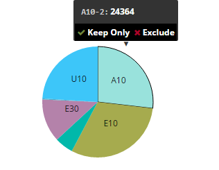
A pie chart is a circular statistical graphic, which is divided into sectors that each represent a proportion of the whole.

Edit Properties:
Calculated Formula: Apllied only when aggregate is Calculated field ex:value1/(Value1-Value2)

add [pocount]/([pocount]+[netvalue]) calculated formula to the same chart

Chart Title: Title of the chart
Width: Width of the chart
Height: Height of the chart
Tool Tip Key: We can define tooltip key in 3 ways: Code, Description, Code And Description. whether we want to display Code, Description or Code And Description in the tool tip key
Measure: In Measure we have all the fields available in the table and we can select any one from the drop down for which we want the chart.
Aggregate: We have aggregate function like Sum, Count, AVG, Calculated Field, MIN, MAX, MEDIAN, DISTINCT and RATIO to get measure
Convert to Absolute ?: Convert value of each group the absolute value before plotting, we have 2 options Yes/No
Dimension description: Select field to display name of dimension in tooltip

Measure Labels: format {“field1”:”Display Name1”,”field2”:”Display Name2”}
Sort Order: To sort the data we have few optiions: None(Data Source Order), Ascending, Alphabetic(A-Z), Alphabetic(Z-A) and Descending. By default None would be selected which has data source order
Show Percentage: Show Percentage in pop up, we have 2 options Yes/No wheter you want to show the percentage or not. Here we are showing data in percentage

Number Format: Number Format is, in which format we want to display the number like .0F
Prefix: We can add some prefix
Suffix: We can add some suffix
Color Type: color typr could be of- By Category, Value Range, Single Color and Field. To set any Color type we need to set some color code
Color Codes: Here we can specify the color codes. Ex: by - Category {“US01”:””,”US02”:”Line”,”US03”:”AVG”}
Color Field: We can set any color field from the drop down
X Axis Title: We can add some title
Y Axis Title: We can add some title
X Axis Label Orientation:
Y Axis Label Orientation:
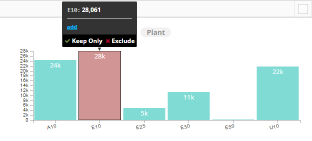
Default selected value(s): We can select some default selected value in the chart like A10

Link Actions: Linking Actions to Chart tooltip. we need to create action and that action we need to configure in pie chart and then it will be accessible in the Link Action field from where we can select Action

Filter Field:
Filter Value:
Top/Bottom -N Filter: Calculation Type:
Filter:N From, We have two options Top and Bottom. If we will select Top it will show 20 from the top of table and if we will select Bottom it will show 20 from the Bottom of table
Filter-N: Default N- value: Here we have to pass some numeric value, It will return the number of rows whatever number we have passed.
Top/Bottom -N Filter: N-Values
Filter By: We can specify any field by which we want to filter the data.
Dynamic Dimension: We can add more than one dimention to the chart

Donut Chart
A donut chart is essentially a Pie Chart with an area of the center cut out.

Calculated Formula: Apllied only when aggregate is Calculated field ex:value1/(Value1-Value2)
Chart Title: Title of the chart
Width: Width of the chart
Height: Height of the chart
Tool Tip Key: We can define tooltip key in 3 ways: Code, Description, Code And Description. whether we want to display Code, Description, Code And Description in the tool tip key
Measure: In Measure we have all the fields available in the table and we can select any one from the drop down for which we want the chart.
Aggregate: We have aggregate function like Sum, Count, AVG, Calculated Field, MIN, MAX, MEDIAN, DISTINCT and RATIO to get measure
Convert to Absolute ?: Convert value of each group the absolute value before plotting, we have 2 options Yes/No
Dimension description: Select field to display name of dimension in tooltip
Measure Labels: format {“field1”:”Display Name1”,”field2”:”Display Name2”}
Sort Order: To sort the data we have few optiions: None(Data Source Order), Ascending, Alphabetic(A-Z), Alphabetic(Z-A) and Descending. By default None would be selected which has data source order
Show Percentage: Show Percentage in pop up, we have 2 options Yes/No wheter you want to show the percentage or not. Here we are showing data in percentage
Number Format: Number Format is, in which format we want to display the number like .0F/,f
Prefix: We can add some prefix
Suffix: We can add some suffix
Color Type: color typr could be of- By Category, Value Range, Single Color and Field. To set any Color type we need to set some color code
Color Codes: Here we can specify the color codes. Ex: by - Category {“US01”:””,”US02”:”Line”,”US03”:”AVG”},
Color Field: We can set any color field from the drop down
X Axis Title: We can add some title
Y Axis Title: We can add some title
X Axis Label Orientation: 0
Y Axis Label Orientation: 0
Default selected value(s): We can select some default selected value in the chart
Link Actions: Linking Actions to Chart tooltip. we need to create action and that action we need to configure in pie chart and then it will be accessible in the Link Action field from where we can select Action
Filter Field:
Filter Value:
Top/Bottom -N Filter: Calculation Type None
Filter:N From, We have two options Top and Bottom. If we will select Top it will show 20 from the top of table and if we will select Bottom it will show 20 from the Bottom of table
Filter-N: Default N- value: Here we have to pass some numeric value, It will return the number of rows whatever number we have passed.
Top/Bottom -N Filter: N-Values
Filter By: We can specify any field by which we want to filter the data.
Dynamic Dimension: We can add more than one dimention to the chart
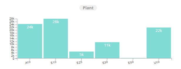
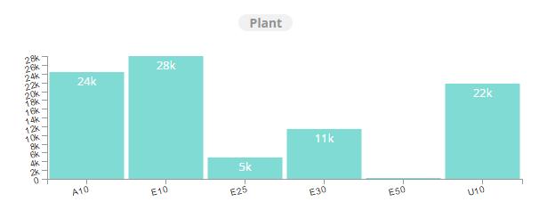
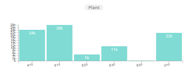
Bar Chart

Calculated Formula: Apllied only when aggregate is Calculated field ex:value1/(Value1-Value2)
Chart Title: Name on the chart
Width: Width of the chart
Height: Height of the chart
Tool Tip Key: Code And Description
Measure: In Measure we have all the fields available in the table and we can select any one from the drop down for which we want the chart.
Measures: We can have more than one measures for bar chart
Aggregate: We have aggregate function like Sum, Count, AVG, Calculated Field, MIN, MAX, MEDIAN, DISTINCT and RATIO to get measure
Convert to Absolute?: Convert value of each group the absolute value before plotting, we have 2 options Yes/No
Dimension description: Select field to display name of dimension in tooltip
Measure Labels format {“field1”:”Display Name1”,”field2”:”Display Name2”}
Sort Order: To sort the data we have few optiions: None(Data Source Order), Ascending, Alphabetic(A-Z), Alphabetic(Z-A) and Descending. By default None would be selected which has data source order
Show Totals Yes
Show Percentage: Show Percentage in pop up, we have 2 options Yes/No whether you want to show the percentage or not. Here we are showing data in percentage
Number Format: Number Format is, in which format we want to display the number
Prefix: We can add some prefix
Bar Width: We can increase or decrease the width of a bar
Suffix: We can add some suffix
Color Type: color typr could be of- By Category, Value Range, Single Color and Field. To set any Color type we need to set some color code
Color Codes Ex: by - Category {“US01”:””,”US02”:”Line”,”US03”:”AVG”},
Color Field: We can set any color field from the drop down
X Axis Title: We can add some title
Y Axis Title: We can add some title
X Axis Label Orientation: We can set the lables to 0 to 90 degrees
Y Axis Label Orientation: We can set the lables to 0 to 90 degrees
Top Margin: Space between top of the chart and top of the chart container (Pixels)
Right Margin: Space between right of the chart and right margin of the chart container (Pixels)

Bottom Margin: Space between X axis and bottom of the chart container (Pixels)

Left Margin: Space between Y axis and left margin of the chart container (Pixels)

Default selected value(s): We can set one or more default selected values

Link Actions: Linking Actions to Chart tooltip, we need to create action and that action we need to configure in pie chart and then it will be accessible in the Link Action field from where we can select Action
Filter Field
Filter Value
Top/Bottom -N Filter: Calculation Type None
Filter:N From : We have two options Top and Bottom. If we will select Top it will show 20 from the top of table and if we will select Bottom it will show 20 from the Bottom of table
Filter-N: Default N- value: Here we have to pass some numeric value, It will return the number of rows whatever number we have passed.
Top/Bottom -N Filter: N-Values
Filter By: We can specify any field by which we want to filter the data.
Dynamic Dimension: We can add more than one dimention to get the chart

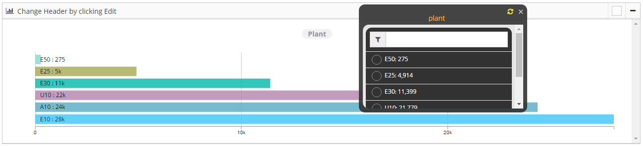
Row Chart

Calculated Formula: Apllied only when aggregate is Calculated field ex:value1/(Value1-Value2) like ([pocount]/([pocount]+[netpr]))*100

Chart Title: Name on the chart
Width: Width of the chart
Height: Height of the chart
Chart Container Height: We can adjust the height of the chart container

Measure: In Measure we have all the fields available in the table and we can select any one from the drop down for which we want the chart.
Aggregate: We hve aggregate function like Sum, Count, AVG, Calculated Field, MIN, MAX, MEDIAN, DISTINCT and RATIO to get measure.
Convert to Absolute?: Convert value of each group the absolute value before plotting
Dimension description: Select field to display name of dimension in tooltip

Measure Labels: format {“field1”:”Display Name1”,”field2”:”Display Name2”}
Sort Order: To sort the data we have few optiions: None(Data Source Order), Ascending, Alphabetic(A-Z), Alphabetic(Z-A) and Descending. By default None would be selected which has data source order like “Sort Order: Ascending”

Show Totals:
Show Percentage: Show Percentage in pop up
Number Format: Number Format is, in which format we want to display the number with coma, decimals etc
Prefix: We can add some prefix
Bar Width: We can increase or decrease the width of a bar
Suffix: We can add some suffix
Color Type: color typr could be of- By Category, Value Range, Single Color and Field. To set any Color type we need to set some color code ex: color Type: Single color and color Code: orange

Color Codes: We can define color codes color type wise. Ex: by - Category {“US01”:””,”US02”:”Line”,”US03”:”AVG”},
Color Field: We can set any color field from the drop down
X Axis Title: We can add some title to X axis
Y Axis Title: We can add some title to Y axis
X Axis Label Orientation: We can set the X axis lables to 0 to 90 degrees
Y Axis Label Orientation: We can set the Y axis lables to 0 to 90 degrees
Hide X Axis
Hide Y Axis
Top Margin: Space between top of the chart and top of the chart container (Pixels)
Right Margin: Space between right of the chart and right margin of the chart container (Pixels)
Bottom Margin: Space between X axis and bottom of the chart container (Pixels)
Left Margin: Space between Y axis and left margin of the chart container (Pixels)
Default selected value(s): We can set one or more default selected values
Link Actions: Linking Actions to Chart tooltip, we need to create action and that action we need to configure in pie chart and then it will be accessible in the Link Action field from where we can select Action
Filter Field
Filter Value
Top/Bottom -N Filter: Calculation Type
Filter:N From : We have two options Top and Bottom. If we will select Top it will show 20 from the top of table and if we will select Bottom it will show 20 from the Bottom of table
Filter-N: Default N- value: Here we have to pass some numeric value, It will return the number of rows whatever number we have passed.
Top/Bottom -N Filter: N-Values
Filter By: We can specify any field by which we want to filter the data.
Dynamic Dimension: We can add more than one dimention to get the chart
Timeline Chart
Edit Properties:
Calculated Formula: Apllied only when aggregate is Calculated field ex:value1/(Value1-Value2)
Chart Title: Name on chart
Width: Width of the chart
Height: Height of the chart
Timeline Type: Days
Measure:
Aggregate: Aggregate Function
Convert to Absolute ?: Convert value of each group the absolute value before plotting
Dimension description: Select field to display name of dimension in tooltip
Sort Order:
Number Format:
Date Format: Format of date in data Ex: %m/%d/%Y (07/23/2016), %m/%d/%y (07/23/16), %Y-%m-%d (2016-07-23), %Y-%m (2016-07), Jan-16 (%b-%y)
Prefix: Add some prefix
Suffix: Add some suffix
Color Type:
Color Codes: Ex: by - Category {“US01”:””,”US02”:”Line”,”US03”:”AVG”},
Color Field:
X Axis Title: We can give some X axis title
Y Axis Title: We can give some Y axis title
X Axis Label Orientation:
Y Axis Label Orientation:
Top Margin: Space between top of the chart and top of the chart container (Pixels)
Right Margin: Space between right of the chart and right margin of the chart container (Pixels)
Bottom Margin: Space between X axis and bottom of the chart container (Pixels)
Left Margin: Space between Y axis and left margin of the chart container (Pixels)
Link Actions: Linking Actions to Chart tooltip
Top/Bottom -N Filter: Calculation Type None Filter:N From Top Filter-N: Default N- value Top/Bottom -N Filter: N-Values Filter By Auto Play Auto Play: Period Type Auto Play: Period Length Play Speed Hide Chart Choose Hide Y Axis in Bar chart Hide Y Axis in Timeline chart Default Selected Date Range
Line Chart
Stacked bar Chart
It is basically a bar chart, In this we can have multiple measures, based on these measures the values will stacked one over the above.

Calculated Formula: Apllied only when aggregate is Calculated field ex:value1/(Value1-Value2)
Chart Title: Name on the chart
Width: Width of the chart
Height: Height of the chart
Measure: In Measure we have all the fields available in the table and we can select any one from the drop down for which we want the chart.
Measures: We can have more than one measures for stacked bar chart
Aggregate: We have aggregate function like Sum, Count, AVG, Calculated Field, MIN, MAX, MEDIAN, DISTINCT and RATIO to get measure
Convert to Absolute ?: Convert value of each group the absolute value before plotting, we have 2 options Yes/No
Dimension description: Select field to display name of dimension in tooltip
Measure Labels: format {“field1”:”Display Name1”,”field2”:”Display Name2”}
Sort Order: To sort the data we have few optiions: None(Data Source Order), Ascending, Alphabetic(A-Z), Alphabetic(Z-A) and Descending. By default None would be selected which has data source order
Show Percentage: Show Percentage in pop up
Number Format: Number Format is, in which format we want to display the number
Prefix: We can add some prefix
Bar Width: Width of the Bar
Suffix: We can add some suffix
Color Type: color typr could be of- By Category, Value Range, Single Color and Field. To set any Color type we need to set some color code
Color Codes: Ex: by - Category {“US01”:””,”US02”:”Line”,”US03”:”AVG”},
Color Field: We can set any color field from the drop down
X Axis Title: We can add some title
Y Axis Title: We can add some title
X Axis Label Orientation: We can set the lables to 0 to 90 degrees
Y Axis Label Orientation: We can set the lables to 0 to 90 degrees
Hide X Axis: We can hide X axis labels

Hide Y Axis: We can hide Y axis labels
Top Margin: Space between top of the chart and top of the chart container (Pixels)
Right Margin: Space between right of the chart and right margin of the chart container (Pixels)
Bottom Margin: Space between X axis and bottom of the chart container (Pixels)
Left Margin: Space between Y axis and left margin of the chart container (Pixels)
Legend grouping (Horizontal/ Vertical): We can set group of legends to the horizontal or vertical

Legend X Position: Legend position: X Value (0 -1, 0 is Left, 1 is Right)
Legend Y Position: Legend position: Y Value (0 -1, 0 is Top, 1 is Bottom)
Default selected value(s): We can set one or more default selected values
Link Actions: Linking Actions to Chart tooltip, we need to create action and that action we need to configure in pie chart and then it will be accessible in the Link Action field from where we can select Action
Link Label: format {“Measure1”:”Action Name1”,”Measure2”:”Action Name2”}
Filter Field: We can select any field to apply filter
Filter Value: We can specify filter value
Top/Bottom -N Filter: Calculation Type: We have 3 types to filter data from Top/Bottom: None, Value and percentage
Filter:N From: We have two options Top and Bottom. If we will select Top it will show 20 from the top of table and if we will select Bottom it will show 20 from the Bottom of table
Filter-N: Default N- value: Here we have to pass some numeric value, It will return the number of rows whatever number we have passed.
Top/Bottom -N Filter: N-Values
Filter By: We can specify any field by which we want to filter the data
Grouped bar Chart
It is basically a bar chart, In this we can have multiple measures, based on these measures the values will grouped one after the other.

Calculated Formula: Apllied only when aggregate is Calculated field ex:value1/(Value1-Value2)
Shows only highlighted bar data in tooltip: Shows only highlighted bar data in tooltip
Chart Title: Name on the chart
Width: Width of the chart
Height: Height of the chart
Tool Tip Key: We can define tooltip key in 3 ways: Code, Description, Code And Description. whether we want to display Code, Description or Code And Description in the tool tip key
Measure: In Measure we have all the fields available in the table and we can select any one from the drop down for which we want the chart.
Measures: We can have more than one measures for grouped bar chart
Aggregate: We have aggregate function like Sum, Count, AVG, Calculated Field, MIN, MAX, MEDIAN, DISTINCT and RATIO to get measure
Convert to Absolute ?: Convert value of each group the absolute value before plotting, we have 2 options Yes/No
Dimension description: Select field to display name of dimension in tooltip
Measure Labels: format {“field1”:”Display Name1”,”field2”:”Display Name2”}
Sort Order: To sort the data we have few optiions: None(Data Source Order), Ascending, Alphabetic(A-Z), Alphabetic(Z-A) and Descending. By default None would be selected which has data source order
Show Totals: You can set wether you want to show the total in bars or not
Show Percentage: Show Percentage in pop up, we have 2 options Yes/No whether you want to show the percentage or not. Here we are showing data in percentage
Number Format: Number Format is, in which format we want to display the number
Prefix: We can add some prefix
Bar Width: Width of the Bar
Suffix: We can add some suffix
Color Type: color typr could be of- By Category, Value Range, Single Color and Field. To set any Color type we need to set some color code
Color Codes: Ex: by - Category {“US01”:””,”US02”:”Line”,”US03”:”AVG”},
Color Field: We can set any color field from the drop down
X Axis Title: We can add some title
Y Axis Title: We can add some title
X Axis Label Orientation: We can set the lables to 0 to 90 degrees
Y Axis Label Orientation: We can set the lables to 0 to 90 degrees
Top Margin: Space between top of the chart and top of the chart container (Pixels)
Right Margin: Space between right of the chart and right margin of the chart container (Pixels)
Bottom Margin: Space between X axis and bottom of the chart container (Pixels)
Left Margin: Space between Y axis and left margin of the chart container (Pixels)
Legend grouping (Horizontal/ Vertical): We can set group of legends to the horizontal or vertical
Legend X Position Legend position: X Value (0 -1, 0 is Left, 1 is Right)
Legend Y Position Legend position: Y Value (0 -1, 0 is Top, 1 is Bottom)
Default selected value(s): We can set one or more default selected values
Link Actions: add Linking Actions to Chart tooltip
Link Label: format {“Measure1”:”Action Name1”,”Measure2”:”Action Name2”}
Filter Field: We can select any field to apply filter
Filter Value: We can specify filter value
Top/Bottom -N Filter: Calculation Type: We have 3 types to filter data from Top/Bottom: None, Value and percentage
Filter:N From Top: We have two options Top and Bottom. If we will select Top it will show 20 from the top of table and if we will select Bottom it will show 20 from the Bottom of table
Filter-N: Default N- value: Here we have to pass some numeric value, It will return the number of rows whatever number we have passed.
Top/Bottom -N Filter: N-Values
Filter By: We can specify any field by which we want to filter the data
Paired Row
Multi level
Geo

Chart Title: Name on the chart
Width: Width of the chart
Height: Height of the chart
Map Type: We have 2 types of map here: USA and WORLD
Measure: In Measure we have all the fields available in the table and we can select any one from the drop down for which we want the chart.
Latitude*: Select latitude field from the drop down
Longitude*: Select longitude field from the drop down
Aggregate: We have aggregate function like Sum, Count, AVG, Calculated Field, MIN, MAX, MEDIAN, DISTINCT and RATIO to get measure
Convert to Absolute ?: Convert value of each group the absolute value before plotting
Dimension description: Select field to display name of dimension in tooltip
Bubble Radius Label: We can set bubble radius
Sort Order: To sort the data we have few optiions: None(Data Source Order), Ascending, Alphabetic(A-Z), Alphabetic(Z-A) and Descending. By default None would be selected which has data source order
Number Format: Number Format is, in which format we want to display the number
Bubble Dimension*: Measure which determines bubble radius
Prefix: We can add some prefix
Suffix: We can add some suffix
Color Type: color typr could be of- By Category, Value Range, Single Color and Field. To set any Color type we need to set some color code
Color Codes: Ex: by - Category {“US01”:””,”US02”:”Line”,”US03”:”AVG”},
X Axis Title: We can add some title
Y Axis Title: We can add some title
X Axis Label Orientation: We can set the lables to 0 to 90 degrees
Y Axis Label Orientation: We can set the lables to 0 to 90 degrees
Default selected value(s): We can set one or more default selected values
Link Actions: Linking Actions to Chart tooltip
Top/Bottom -N Filter: Calculation Type: We have 3 types to filter data from Top/Bottom: None, Value and percentage
Filter:N From Top: We have two options Top and Bottom. If we will select Top it will show 20 from the top of table and if we will select Bottom it will show 20 from the Bottom of table
Filter-N: Default N- value: Here we have to pass some numeric value, It will return the number of rows whatever number we have passed.
Top/Bottom -N Filter: N-Values
Filter By: We can specify any field by which we want to filter the data
Google Map
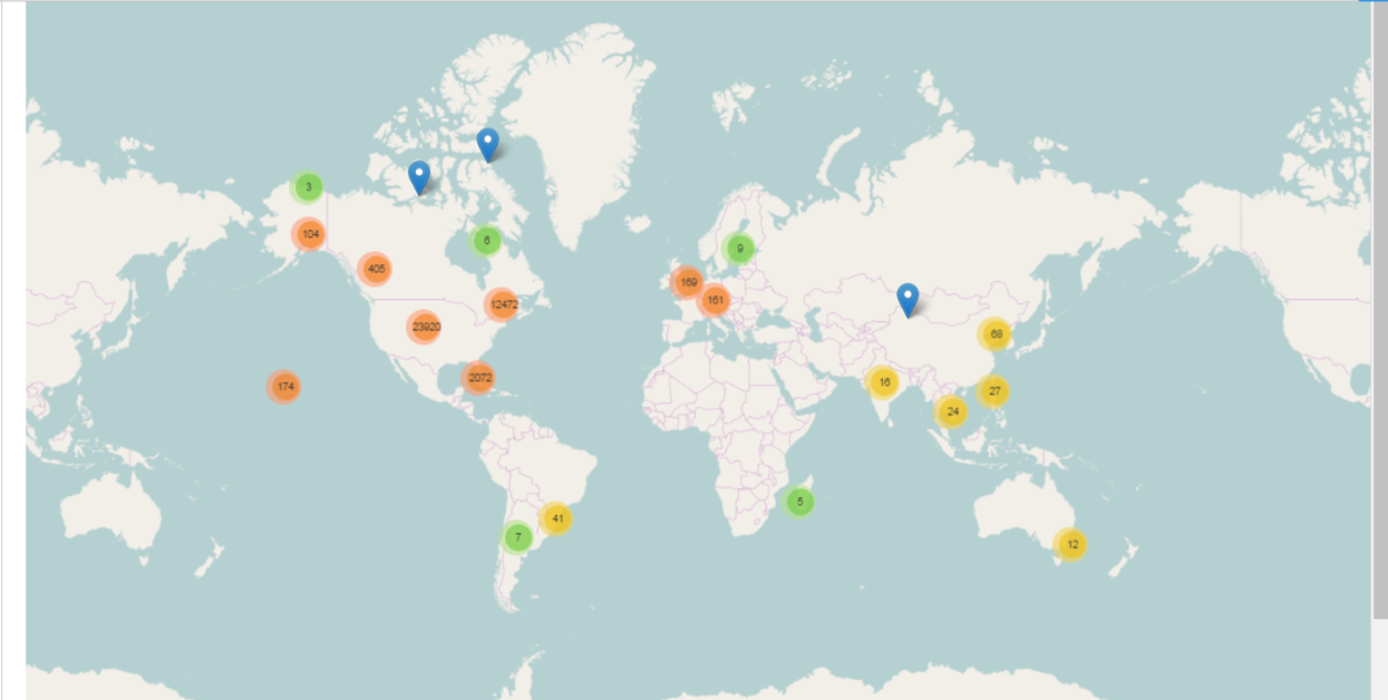
Chart Title: Name on the chart
Width: Width of the chart
Height: Height of the chart
Measure: In Measure we have all the fields available in the table and we can select any one from the drop down for which we want the chart.
Latitude*: latitude field is compulsary
Longitude*: longitude field is compulsary
Aggregate: We have aggregate function like Sum, Count, AVG, Calculated Field, MIN, MAX, MEDIAN, DISTINCT and RATIO to get measure
X Axis Measure
Y Axis Measure
Convert to Absolute ?: Convert value of each group the absolute value before plotting
Dimension description: Select field to display name of dimension in tooltip
Bubble Radius Label:
Show Percentage: Show Percentage in pop up
Bubble Dimension*: Measure which determines bubble radius
Prefix: We can add some prefix
Suffix: We can add some suffix
Color Type: color typr could be of- By Category, Value Range, Single Color and Field. To set any Color type we need to set some color code
Color Codes: Ex: by - Category {“US01”:””,”US02”:”Line”,”US03”:”AVG”},
X Axis Title: We can add some title
Y Axis Title: We can add some title
X Axis Label Orientation: We can set the lables to 0 to 90 degrees
Y Axis Label Orientation: We can set the lables to 0 to 90 degrees
Default selected value(s): We can set one or more default selected values
Filter Field: We can select any field to apply filter
Filter Value: We can specify filter value
Top/Bottom -N Filter: Calculation Type: We have 3 types to filter data from Top/Bottom: None, Value and percentage
Filter:N From: We have two options Top and Bottom. If we will select Top it will show 20 from the top of table and if we will select Bottom it will show 20 from the Bottom of table
Filter-N: Default N- value: Here we have to pass some numeric value, It will return the number of rows whatever number we have passed.
Top/Bottom -N Filter: N-Values
Filter By: We can specify any field by which we want to filter the data
Bubble
Heat Map
Distribution
Composite
Hierarchie
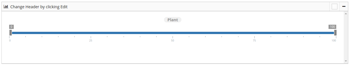
Range Slider
- Calculated Formula: Apllied only when aggregate is Calculated field ex:value1/(Value1-Value2)
- ([pocount]/([pocount]+[netvalue]))*100
Chart Title: Name on the slider
Width: Width of the chart
Height: Height of the chart
Measure:
Aggregate: Aggregate Function
Convert to Absolute ?: Convert value of each group the absolute value before plotting
Dimension description: Select field to display name of dimension in tooltip
Sort Order:
Number Format:
Prefix: Add some prefix
Suffix: Add some suffix
Filter From: default selection of slider range starts from,(it should be between 0 to 99)
Filter To: default selection of slider range ends to,(it should be between 1 to 100)
Color Type:
Color Codes: Ex: by - Category {“US01”:””,”US02”:”Line”,”US03”:”AVG”},
X Axis Title: Add X axis title
Y Axis Title: Add Y axis title
X Axis Label Orientation:
Y Axis Label Orientation:
Default selected value(s):
Top/Bottom -N Filter: Calculation Type:
Filter:N From :
Filter-N: Default N- value:
Top/Bottom -N Filter: N-Values: